Showing posts with label digital collections. Show all posts
Tuesday, September 13, 2016
The Enigmatic Ferdinand Flipper
Within Dartmouth College's Library Digital Collections is a piece listed as the first comic book written in the U.S., The Fortunes of Ferdinand Flipper. An interesting piece, quite funny, and a nice look into the past. I sat down to write a short blog post about the piece and compare it to other similar pieces within the library digital collections. Simple.
I start from the top, planning to gather some information about each piece. Title page. The Fortunes of Ferdinand Flipper. I flip the page. "New York: Published at the Brother Jonathan Office." No author listed. I have authors for the other two pieces, and think it would be nice
to complete the set. I'll have to track this mysterious author down.
Little do I realize the momentous task I'm about to undertake
I do a preliminary Google search of Brother Jonathan. First result, a
Wikipedia article. I see an illustration of a man with striped pants,
stove top hat, and overcoat. The article reads "The national
personification and emblem of New England." From his garb, I can
see that he's clearly the inspiration for Uncle Sam. Interesting, but
not what I'm looking for. Farther down it reads, "...widely
popularized by the weekly newspaper Brother Jonathan and the
widely popular humor magazine Yankee Notions."
I follow the link to the article on the Brother Jonathan paper. "Brother Jonathan was a weekly publication operated by Benjamin Day from 1842-1862, and was the first weekly publication in the United States." I read on. Day founded the first penny newspaper in the U.S., The New York Sun, but sold it to his brother-in-law in 1838. Day and partner James Wilson acquired Brother Jonathan sometime after this and began publishing the paper name in 1842. The paper eventually reached a circulation as high as sixty to seventy thousand. Impressive, especially for the time. Perhaps Day is the mystery author I've been looking for. I click the Benjamin Day link.
Day was born in Springfield, Mass. in 1810. Started his career at the Springfield Republican. Credited with founding sensationalism and bringing the London Plan of paper distribution to the U.S. You know the cliché of a kid with a cap and suspenders yelling "Read all about it!" on the street
corner? That's the London Plan. Publishers sold papers to these industrious young men in bulk, who would then sell them on their own for profit. Anyway, it seems that Day stayed on the managerial side of things and wasn't an illustrator himself. No luck. Maybe the mystery "author" is an illustrator who worked for the paper. I decided to head the the source.
I know that The Fortunes of Ferdinand Flipper was published some time in the 1850s. This should help narrow down my search. I search for digital copies of The Brother Jonathan magazine.
I begin my search at Dartmouth's own library website. I type Brother Jonathan into the search box. First result, Brother Jonathan by Weld, H. Hastings; Neal John; etc. Book, 1842. That could be it. I click the link. Imprint New York: [Wilson & Co.], 1842-1843. Frequency: Weekly. This looks like the right place.
I see that digital versions of the paper are available. I follow the link to a ProQuest page which contains a number of pdfs of sections from the paper. Oddly, only volumes from 1842 and 1843 are present. Even though these volumes were published at least seven years before Ferdinand Flipper, it's still possible that they could provide some helpful information. Alas, despite a lengthy search, I can find no trace of illustrators credited.
It appears that Day and Wilson populated their magazine with plagiarized material, mostly from European authors and illustrators. The Adventures of Mr. Obadiah Oldbuck, also included in our digital collection, was one such piece. You can read a blog post on the piece here. So was Ferdinand Flipper created in the U.S. or was it stolen from outside this country?
I search for mentions of plagiarism in early comics. I find a thread on a comic book collectors forum in which people discuss early comics. Most of the discussion revolves around an attempt to define comic books as compared to other early illustrated works. It's interesting, although not particularly relevant to my search. However, some length down the forum I find a post which references an exchange from American Notes and Queries 1941 amongst a number of cultural historians. Within the post author W.H.P. lists the date of publication for The Fortunes of Ferdinand Flipper as 1858. I now have a specific year. If I can find a copy of Brother Jonathan from 1858 I might be able to find some clue.
I begin to pour through the library records searching for any copies of Brother Jonathan from after 1843. I try Harvard and Stanford digital archives. No luck. I try libraries in New York, where Brother Jonathan was published. NYU, Columbia. Still nothing.
I head to New York's census website to see if I can track down employees of the Brother Jonathan paper. The website is confusing. I give up immediately.
It seems that nobody knows who wrote The Fortunes of Ferdinand Flipper. But I can't give up. Now it's personal. To be continued?
Addendum: I had planned to spend some time hunting down the mystery author. But alas, during a brief return to the book Father of the Comic Strip: Rodolphe Topffer, by David Kunzle I see a small section on The Fortunes of Ferdinand Flipper that I had missed during my original perusal of that source.
Kunzle writes of Ferdinand Flipper, "The whole thing is cobbled together from a miscellany of woodcuts, mostly French, whose chance availability determines the narrative, such as it is, rather as in the parlor game "Consequences."
So there you have it. There is no single creator of The Fortunes of Ferdinand Flipper. It is the offspring of many minds and craftsmen, and the rascal newspaperman, Benjamin Day, who robbed them of their intellectual property. So it goes.
Written by Kevin Warstadt
Tuesday, July 12, 2016
How I Joined My Local Historical Society
Until coming to Dartmouth, I'd pretty much always lived in large cities. The politics and agencies that made these cities function were somewhat of a mystery to me - I knew work was done by people somewhere, but the processes and responsible agents felt distant and mysterious.
Living in small town Vermont is a totally different scene. The business and services of our town, Strafford VT, population ~1000, is run by people I see at the general store, who work at the local school, who live down the street. My friends are on the Volunteer Fire Department, my husband attends meetings of the Conservation Committee, my neighbor is on the School Board.
After we settled in to town, I wanted to get involved, too. Given my experience in preservation departments big and small, the Strafford Historical Society seemed a natural fit. This past January, I emailed the chairman of the Historical Society Board, explaining my educational and professional background in preservation, as well as my current work with digital projects and digital preservation. The response was immediate and enthusiastic: "OH MY GOD WHEN CAN WE MEET WITH YOU THIS IS EXACTLY WHAT WE NEED YOU ARE AN ANSWER TO OUR PRAYERS" (I've paraphrased).
It turns out, the Strafford Historical Society has long felt a need for a more developed web presence, and has dreamed of putting their collections online. Can you, they asked, build us a website, digitize our collections and make them searchable for the world on a very small (non-existant) budget? Having never built a website, and knowing how much work, infrastructure and expertise goes into creating digital collections, I said, "Sure! But it might take us a while."
Over the past few months, we've had a few meetings of the ad hoc Technology Committee of the Strafford Historical Society. We've identified people in town with programming and systems admin skills that can help us set up an Omeka instance. People have volunteered time for "data entry" (i.e. metadata creation) so they can learn more about the collections. We even got a donation of a scanner from a generous Board member.
Building out a digital presence from scratch with few budgetary or infrastructure resources could seem daunting and overwhelming, but I'm feeling pretty optimistic we can do this thing. The past two years have shown me that this town is full of talented people willing to contribute time, willing to share knowledge and expertise, and willing to learn new skills to serve the good of the town. We've totally got this.
Written by Jenny Mullins
![]() |
| Strafford's Iconic Town House |
After we settled in to town, I wanted to get involved, too. Given my experience in preservation departments big and small, the Strafford Historical Society seemed a natural fit. This past January, I emailed the chairman of the Historical Society Board, explaining my educational and professional background in preservation, as well as my current work with digital projects and digital preservation. The response was immediate and enthusiastic: "OH MY GOD WHEN CAN WE MEET WITH YOU THIS IS EXACTLY WHAT WE NEED YOU ARE AN ANSWER TO OUR PRAYERS" (I've paraphrased).
![]() |
| The Brick Store- Home of the Historical Society |
Over the past few months, we've had a few meetings of the ad hoc Technology Committee of the Strafford Historical Society. We've identified people in town with programming and systems admin skills that can help us set up an Omeka instance. People have volunteered time for "data entry" (i.e. metadata creation) so they can learn more about the collections. We even got a donation of a scanner from a generous Board member.
Building out a digital presence from scratch with few budgetary or infrastructure resources could seem daunting and overwhelming, but I'm feeling pretty optimistic we can do this thing. The past two years have shown me that this town is full of talented people willing to contribute time, willing to share knowledge and expertise, and willing to learn new skills to serve the good of the town. We've totally got this.
Written by Jenny Mullins
Tuesday, June 28, 2016
Recent Additions to the Dartmouth Digital Collections
Dartmouth College and Associated Schools General Catalogue, 1769-1940
Published in 1940, the General Catalogue of Dartmouth College is a directory of Dartmouth's administrative officers and faculty; graduate and non-graduate alumni of the undergraduate college; graduate and non-graduate alumni of the professional schools and graduate programs; special students; and honorary degree recipients, dating from the founding of Dartmouth in 1769 through the class of 1939. The entries for alumni provide brief biographical information including birth date and place, residence (for those living at the time of publication), death date and place (for the deceased), occupation, Dartmouth degrees, and any additional educational information. Similar information is included for officers and faculty, plus their term of service to the College. Entries for non-graduates of the undergraduate college often include the time period during which they were in attendance. The catalogue contains three indexes: to officers and faculty; to alumni; and geographical index to where alumni were living at the time of the catalogue's publication.
Stone Family Papers, 1571-1933
The papers of the Stone family contain parchment indentures, covenants, probate deeds and wills, manuscript notes, letters, receipts and invoices. The documents chronicle the legal transactions of Richard Stone (circa 1570-1653) of Clayhanger, Devon and Chipstable, Somerset, England and his descendants. Seen together the materials shed light on the evolution of British legal documents from 1571 to 1872. Richard Stone of Clayhanger, Devon and Chipstable, Somerset was born in the 1570s and died in 1653. Richard was married twice and had eight children. The line of descent from his son Emanuel Stone from his first marriage can be traced in the UK and USA to the present day. The line of descent from his son Richard from his second marriage also can be traced to the present day in the UK, Australia and New Zealand. The original manuscripts are available for use at Rauner Special Collections Library (Rauner Manuscript MS-1339).
Chinese Love Stories from "Ch'ing-shih" by Hua-yuan Li Mowry
There are currently fifty open access ebooks available on the Digital Library Publishing pages (http://www.dartmouth.edu/~library/digital/publishing/books/). Chinese Love Stories from "Ch'ing-shih" by Hua-yuan Li Mowry is the latest addition to the collection. Ch'ing-shih is a lovingly made anthology of love stories, provided we push the limits of definition of "love story" just a little wider than they are usually set. The stories are classified into twenty-four major categories, each further divided into subsections and concluded with a paragraph of commentary. Professor Mowry provides a sampling of the contents of each category but not of each subsection, though the headings themselves are enough to pique our curiosity; shall we turn next to "incomplete resurrections," or "unusual degenerates"? The stories were collected in the early seventeenth century, just a decade or two before the fall of the Ming dynasty, but nine-tenths of them are pre-Ming in origin. Whether the earliest or the most recent stories have the higher artistic value will be a matter for the reader's judgement. - From the Preface.
Written by Bill Ghezzi
Published in 1940, the General Catalogue of Dartmouth College is a directory of Dartmouth's administrative officers and faculty; graduate and non-graduate alumni of the undergraduate college; graduate and non-graduate alumni of the professional schools and graduate programs; special students; and honorary degree recipients, dating from the founding of Dartmouth in 1769 through the class of 1939. The entries for alumni provide brief biographical information including birth date and place, residence (for those living at the time of publication), death date and place (for the deceased), occupation, Dartmouth degrees, and any additional educational information. Similar information is included for officers and faculty, plus their term of service to the College. Entries for non-graduates of the undergraduate college often include the time period during which they were in attendance. The catalogue contains three indexes: to officers and faculty; to alumni; and geographical index to where alumni were living at the time of the catalogue's publication.
Stone Family Papers, 1571-1933
The papers of the Stone family contain parchment indentures, covenants, probate deeds and wills, manuscript notes, letters, receipts and invoices. The documents chronicle the legal transactions of Richard Stone (circa 1570-1653) of Clayhanger, Devon and Chipstable, Somerset, England and his descendants. Seen together the materials shed light on the evolution of British legal documents from 1571 to 1872. Richard Stone of Clayhanger, Devon and Chipstable, Somerset was born in the 1570s and died in 1653. Richard was married twice and had eight children. The line of descent from his son Emanuel Stone from his first marriage can be traced in the UK and USA to the present day. The line of descent from his son Richard from his second marriage also can be traced to the present day in the UK, Australia and New Zealand. The original manuscripts are available for use at Rauner Special Collections Library (Rauner Manuscript MS-1339).
Chinese Love Stories from "Ch'ing-shih" by Hua-yuan Li Mowry
There are currently fifty open access ebooks available on the Digital Library Publishing pages (http://www.dartmouth.edu/~library/digital/publishing/books/). Chinese Love Stories from "Ch'ing-shih" by Hua-yuan Li Mowry is the latest addition to the collection. Ch'ing-shih is a lovingly made anthology of love stories, provided we push the limits of definition of "love story" just a little wider than they are usually set. The stories are classified into twenty-four major categories, each further divided into subsections and concluded with a paragraph of commentary. Professor Mowry provides a sampling of the contents of each category but not of each subsection, though the headings themselves are enough to pique our curiosity; shall we turn next to "incomplete resurrections," or "unusual degenerates"? The stories were collected in the early seventeenth century, just a decade or two before the fall of the Ming dynasty, but nine-tenths of them are pre-Ming in origin. Whether the earliest or the most recent stories have the higher artistic value will be a matter for the reader's judgement. - From the Preface.
Written by Bill Ghezzi
Tuesday, May 17, 2016
Image Resolution and You
Picking your resolution is perhaps the most important decision you'll make when digitizing photos, artwork, or any other kind of image. But it can also be confusing if you're not familiar with these terms and their meanings. This is a simple primer to help you choose the right resolution for your needs.
The terms DPI and PPI are both shorthand units for measuring an image's resolution. DPI stands for "dots per inch" and PPI, "pixels per inch." This means that DPI is technically a term for a printed object's resolution while PPI describes an image displayed on a screen, but in common use they are essentially interchangeable.
The system that these measurements describe is called Raster, and it's by far the most common in a modern digital setting. A raster image is essentially a mosaic, collecting dots of color called pixels in a tiny square grid to produce an overall image. The more pixels per inch, the more detailed the image. Simple enough, right? For an easy example, here is the same image at three different standard resolutions: 600dpi, 300dpi, and 72dpi (click to see at full size)
You can always lower the resolution of an image, but it's impossible to raise it, except in a simple multiplying sense. This is why all digital images look blurry if you zoom in far enough. You're making the pixels bigger, but you aren't adding any new information to them.
Another factor you will want to consider is your display resolution. Modern high-definition TVs will often give you this basic measurement, and while computers have a greater variety of resolutions they will generally fall under a few typical values. 480p means a screen is 480 pixels wide, and is considered "standard" definition. 720p is, of course, 720 pixels wide, and marks the beginning of "HD" standards. 1080p is probably the most commonly used HD resolution, and the cutting-edge "4K" resolution is a convenient shorthand for screens 3,840 pixels wide. The screen resolution will determine how "large any given image looks at full-resolution on the screen. If you try to stretch a 480p wide image across 1080 pixels, it will look bad.
While the ideas surrounding pixel resolution, display resolution, and print resolution are quite complicated, they can still be understood easily with a few guidelines. For most purposes you can create images using 3 different resolutions:
600ppi is what we at the Dartmouth Digital Library Program use as the standard for high quality "master" images. Although many scanners can go higher, the size of the file becomes very unwieldy at that point. My advice is to always start at at least 600. Better to have a high-quality image and not need it than to need it and not have it.
300ppi is a common resolution for a high-quality print. Unlike looking at a screen where the resolution can be shrunk or blown up, a printer is rigidly limited in the amount of detail it can put into any given area. While a particularly good printer may get higher resolutions, most will clock in around 300dpi. This lower resolution also makes transferring files for print easier. And of course, it's always useful to keep your higher-res files around in case you need to go back to them.
72ppi has become the most common display resolution on the internet. There are a few things to consider before simply converting your image into 72ppi. Look at your display, and understand what its resolution is. Then consider how "big" you want your image to look on the display. So, if you have a 1080p monitor and want an image that fills the whole screen, you'll want to change your ppi to 72, AND change your image width to 1080p at the same time, with the proportions locked.
This is often a confusing concept to grasp. The simplest way I can think of is: if you reduce a 300ppi image to 150ppi, but also double its size, it will essentially be the same image when you see it on your computer. But if you try to print that, it will be half as detailed by virtue of being twice as big.
Fortunately, you don't need to fully understand all of this in order to create and work with high-quality images. As long as you make sure your highest-quality 600ppi master versions are safely backed up, you can play around with these variables in Photoshop or any other imaging program until you meet your own needs. Understanding how screen resolution, print resolution, and image resolution work together is an ongoing process that changes with technology as well as peoples' needs. It's important to be consistent, especially so for an institution like ours, but it's equally important to know how to adapt to your own needs.
Written by Ryland Ianelli
The terms DPI and PPI are both shorthand units for measuring an image's resolution. DPI stands for "dots per inch" and PPI, "pixels per inch." This means that DPI is technically a term for a printed object's resolution while PPI describes an image displayed on a screen, but in common use they are essentially interchangeable.
The system that these measurements describe is called Raster, and it's by far the most common in a modern digital setting. A raster image is essentially a mosaic, collecting dots of color called pixels in a tiny square grid to produce an overall image. The more pixels per inch, the more detailed the image. Simple enough, right? For an easy example, here is the same image at three different standard resolutions: 600dpi, 300dpi, and 72dpi (click to see at full size)
You can always lower the resolution of an image, but it's impossible to raise it, except in a simple multiplying sense. This is why all digital images look blurry if you zoom in far enough. You're making the pixels bigger, but you aren't adding any new information to them.
Another factor you will want to consider is your display resolution. Modern high-definition TVs will often give you this basic measurement, and while computers have a greater variety of resolutions they will generally fall under a few typical values. 480p means a screen is 480 pixels wide, and is considered "standard" definition. 720p is, of course, 720 pixels wide, and marks the beginning of "HD" standards. 1080p is probably the most commonly used HD resolution, and the cutting-edge "4K" resolution is a convenient shorthand for screens 3,840 pixels wide. The screen resolution will determine how "large any given image looks at full-resolution on the screen. If you try to stretch a 480p wide image across 1080 pixels, it will look bad.
While the ideas surrounding pixel resolution, display resolution, and print resolution are quite complicated, they can still be understood easily with a few guidelines. For most purposes you can create images using 3 different resolutions:
600ppi is what we at the Dartmouth Digital Library Program use as the standard for high quality "master" images. Although many scanners can go higher, the size of the file becomes very unwieldy at that point. My advice is to always start at at least 600. Better to have a high-quality image and not need it than to need it and not have it.
300ppi is a common resolution for a high-quality print. Unlike looking at a screen where the resolution can be shrunk or blown up, a printer is rigidly limited in the amount of detail it can put into any given area. While a particularly good printer may get higher resolutions, most will clock in around 300dpi. This lower resolution also makes transferring files for print easier. And of course, it's always useful to keep your higher-res files around in case you need to go back to them.
72ppi has become the most common display resolution on the internet. There are a few things to consider before simply converting your image into 72ppi. Look at your display, and understand what its resolution is. Then consider how "big" you want your image to look on the display. So, if you have a 1080p monitor and want an image that fills the whole screen, you'll want to change your ppi to 72, AND change your image width to 1080p at the same time, with the proportions locked.
![]() |
| Here we can see Photoshop's image size menu (Image -> Image Size), where the pixel width and resolution are changed while the proportions remain constrained. |
This is often a confusing concept to grasp. The simplest way I can think of is: if you reduce a 300ppi image to 150ppi, but also double its size, it will essentially be the same image when you see it on your computer. But if you try to print that, it will be half as detailed by virtue of being twice as big.
Fortunately, you don't need to fully understand all of this in order to create and work with high-quality images. As long as you make sure your highest-quality 600ppi master versions are safely backed up, you can play around with these variables in Photoshop or any other imaging program until you meet your own needs. Understanding how screen resolution, print resolution, and image resolution work together is an ongoing process that changes with technology as well as peoples' needs. It's important to be consistent, especially so for an institution like ours, but it's equally important to know how to adapt to your own needs.
Written by Ryland Ianelli
Tuesday, September 15, 2015
Digital Production Roundup
Sometimes great content comes through the Digital Production offices and we don't have a chance to share it. Here are a few of my favorite selections from recent shooting sessions:
Written by Ryland Ianelli
![]() |
| "The Flayed Angel" by Jacques Fabien Gautier D'Agoty, available to view in Rauner Special Collections. Read more about it here |
![]() |
| A design for a theatrical device by Denis Diderot, co-founder/chief editor/contributor to the Encyclopédie with Jean le Rond d'Alembert |
![]() |
| Vintage ad from Dartmouth Alum Robert L. May's scrapbook. May created the Rudolph character in 1939; read more about him here |
![]() |
| Concert posters from Dartmouth history, scanned for an exhibit in the Baker Berry Library: Fleshtones concert poster, 1983 |
![]() |
| Spring Formal poster with Duke Ellington |
![]() |
| New Hampshire maps from the Evans Map Room, scanned as part of the Granite State Maps project |
![]() |
| Map illustrations |
Written by Ryland Ianelli
Tuesday, June 23, 2015
Baker Library in the Dartmouth College Photographic Files Collection
During the month of May, close to 1500 photographs of Baker Library were added to the Dartmouth College Photographic Files Collection. Included are many photos of the Baker Library building, interior and exterior, including its construction, as well as people that have worked here over many years. Here are some samples:
View a much larger selection here.
The Dartmouth College Photographic Files project began in early 2012 and is part of the Dartmouth Digital Collections. The project's goal is to make over 80,000 photographs stored in file cabinets in Rauner Special Collections available online. Images date from the early years of photography (ca. 1850s) to the present and include images of nearly all aspects of Dartmouth College life. To date there are over 36,000 photos from the collection online. We add approximetly 1,000 photographs to the collection every month. We are working through the photographs alphabetically and have reached the letter "M". See additional photographs of Feldbery Library; Dana Biomedical Library and Kresge Library.
If you have questions about the Photographic Files Collection contact Rauner Special Collections If you have questions about the ditital imaging of the collection contact William B. Ghezzi or Ryland Ianelli in the Digial Production Unit.
Written by William B. Ghezzi
View a much larger selection here.
The Dartmouth College Photographic Files project began in early 2012 and is part of the Dartmouth Digital Collections. The project's goal is to make over 80,000 photographs stored in file cabinets in Rauner Special Collections available online. Images date from the early years of photography (ca. 1850s) to the present and include images of nearly all aspects of Dartmouth College life. To date there are over 36,000 photos from the collection online. We add approximetly 1,000 photographs to the collection every month. We are working through the photographs alphabetically and have reached the letter "M". See additional photographs of Feldbery Library; Dana Biomedical Library and Kresge Library.
If you have questions about the Photographic Files Collection contact Rauner Special Collections If you have questions about the ditital imaging of the collection contact William B. Ghezzi or Ryland Ianelli in the Digial Production Unit.
Written by William B. Ghezzi
Monday, April 13, 2015
Merging Images in Photoshop, Part Two
While my first post in this series covered some basics of non-destructive image merging in Adobe Photoshop, this post aims to give you some tools to work with less ideal images.
A typical problem faced by many when attempting to merge images is how to deal with slight variations in your materials. These variations can be a result of the hardware you use (scanner or camera), lighting conditions, software, or a myriad other factors.
In this scenario I'll use an image from a scanned book that has a lighting problem. This is a very common difficulty when scanning books on a flatbed; the book's gutter will raise up from the scanner's surface, giving it a darker tone and distorting the content. Applying pressure to the book may work sometimes, but often we do not want to risk damaging our books (or, worst-case-scenario, our equipment) that way. Much safer to work digitally.
The first step is identifying the cutoff point where the gutter begins to negatively affect image quality. As you can see from this image. As always, make sure you've saved a master version before making any edits.
Use the Rectangle Marquee tool to isolate the "safe zone" of the page, where the page's content is mostly unaffected by the gutter. Copy this selection and paste it into a new document with approximately the same dimensions as the original document. This is our new "base" document. I will usually put the word "EDIT" in its title somewhere so it won't be mistaken for the master.
In situations like this when we are dealing with an off-white paper, we'll want to make sure our background matches the paper's tone. Use the Eyedropper tool to select the page tone, and use the paint bucket to fill it in the background of the new base document.
What we are going to do next is create an amalgam of the image's two elements (page and background) to create a new version with improved legibility. To accomplish this we are going to use Photoshop's Layer Mask tool. Layer Mask is incredibly useful for photo editing, and best of all it is a non-destructive solution, meaning whatever you do with it can always be easily undone. The Layer Mask is very much what it sounds like: a layer placed on top of each image that can be "masked" or "unmasked," concealing or revealing the image's contents. Select the right side layer and click "Add Layer Mask" at the bottom of the Layer menu. You will now see a small white rectangle linked to that layer; that's your layer mask. The color white means "unmasked," so right now it's simply sitting on top of your original layer waiting for you to give it instructions.
Next, be sure you have the correct layer, AND your layer mask selected, or else you will alter the image itself. The Layer Mask functions in grayscale. Black is "masked," white is "unmasked," and grays are everything in between. Set your foreground color to black. Select the brush tool, and reduce the hardness to 0 (use whatever diameter you feel comfortable with). Check again to make sure you're still on your layer mask, and simply begin lightly touching up the problem spots along the gutter with your brush. Use single clicks rather than click-and-drag, that way you will make very minor adjustments while you get a feel for the technique.
As you can see, we've fixed the page to appear legible and flat. But be warned, this exact method won't work for every situation. If you have content that is deep in the book's gutters, you will likely have to accept a less-than-perfect image. However these techniques can still be used to improve the image quality in those situations, it is simply more difficult to get a "perfect" image. Vary your brush settings and color in the Layer Mask (experiment using a 50% grayscale) to find solutions that best suit your situation.
Written by Ryland Ianelli
A typical problem faced by many when attempting to merge images is how to deal with slight variations in your materials. These variations can be a result of the hardware you use (scanner or camera), lighting conditions, software, or a myriad other factors.
In this scenario I'll use an image from a scanned book that has a lighting problem. This is a very common difficulty when scanning books on a flatbed; the book's gutter will raise up from the scanner's surface, giving it a darker tone and distorting the content. Applying pressure to the book may work sometimes, but often we do not want to risk damaging our books (or, worst-case-scenario, our equipment) that way. Much safer to work digitally.
The first step is identifying the cutoff point where the gutter begins to negatively affect image quality. As you can see from this image. As always, make sure you've saved a master version before making any edits.
In situations like this when we are dealing with an off-white paper, we'll want to make sure our background matches the paper's tone. Use the Eyedropper tool to select the page tone, and use the paint bucket to fill it in the background of the new base document.
What we are going to do next is create an amalgam of the image's two elements (page and background) to create a new version with improved legibility. To accomplish this we are going to use Photoshop's Layer Mask tool. Layer Mask is incredibly useful for photo editing, and best of all it is a non-destructive solution, meaning whatever you do with it can always be easily undone. The Layer Mask is very much what it sounds like: a layer placed on top of each image that can be "masked" or "unmasked," concealing or revealing the image's contents. Select the right side layer and click "Add Layer Mask" at the bottom of the Layer menu. You will now see a small white rectangle linked to that layer; that's your layer mask. The color white means "unmasked," so right now it's simply sitting on top of your original layer waiting for you to give it instructions.
Next, be sure you have the correct layer, AND your layer mask selected, or else you will alter the image itself. The Layer Mask functions in grayscale. Black is "masked," white is "unmasked," and grays are everything in between. Set your foreground color to black. Select the brush tool, and reduce the hardness to 0 (use whatever diameter you feel comfortable with). Check again to make sure you're still on your layer mask, and simply begin lightly touching up the problem spots along the gutter with your brush. Use single clicks rather than click-and-drag, that way you will make very minor adjustments while you get a feel for the technique.
As you can see, we've fixed the page to appear legible and flat. But be warned, this exact method won't work for every situation. If you have content that is deep in the book's gutters, you will likely have to accept a less-than-perfect image. However these techniques can still be used to improve the image quality in those situations, it is simply more difficult to get a "perfect" image. Vary your brush settings and color in the Layer Mask (experiment using a 50% grayscale) to find solutions that best suit your situation.
Written by Ryland Ianelli
Tuesday, March 17, 2015
File Validation Woes
Over the last few months I have been preparing and ingesting the master TIFF files for the Photo Files collection into our local repository system for safe keeping. The first step is to package the files using the BagIt specification. BagIt was developed by the Library of Congress and the California Digital Library as a way to package files along with some basic metadata that can be used to validate the bags contents. It's the digital equivalent of putting a bunch of things in a box, along with a list of the box’s contents and a unique identifier that can be used to identify each item. Since our Photo Files collection is enormous (so far I’ve deposited over 45,000 images, and we’re not even half way through the collection), I break the bags into manageable chunks for uploading and processing in our repository.
Once a bag is uploaded onto the server, it is validated using the BagIt tool. This is a programmatic way of checking that all the files are still exactly as they should be, and no file has been altered or gone missing or snuck in on the sly. Finally, the contents of the bags are run through the File Information Tool Set, or FITS. FITS brings together a bunch of open-source tools that identify file types, check to see if those files are valid, and extract technical metadata. So, for instance, when I deposit a bag from the Photo Files collection, FITS produces a report that says “These files are TIFFs! These TIFFs are well formed and valid! Here’s some technical info you might want to have around!”, only with less exclamation marks:
So, this process has been going along just swimmingly until a few weeks ago. Like I said, I’d made it through about 45,000 images, and then suddenly, BAM! an error report for every single image:
page-masters/Icon1647-0875-0000010A.tif is not valid: "Type mismatch for tag 700; expecting 1, saw 7"
The problem with these images was the 700 tag. From the Library of Congress’ super useful guide to TIFF tags I learned that this tag has something to do the XMP metadata within the file. XMP is a data model for structuring embedded metadata. Data models for metadata help standardize how metadata is stored. For instance, I could edit an image to say “Author: Jane Doe”, while someone else might edit it to say “Photographer: Jane Doe” and we could both mean the same thing. A data model would say, “Ok, everyone, we’re going to use the term Creator.” This makes it easier for both humans and computers to make use of embedded metadata, making digital objects more discoverable and easier to maintain.
So, now I knew that there was a problem with the metadata we were embedding in the files. Something about a 1 and a 7? Deep inside the Photoshop user forums, I found that I was not the first one to run across this problem. These numbers refer to the type field in the XMP, with 1 meaning “byte” and 7 meaning “unknown”. So these files said "unknown" when they should have said “byte”, right? Well, not really. According to David Franzen (Employee)’s response in the user forum, both the 1 and the 7 were valid values. So why was I getting this error message?
However, the updated version of Jhove didn’t make its way into FITS. Apparently, there were some other changes to Jhove 1.8 that would make integrating the newer version into FITS a rather large job. Making the necessary changes to FITS to accept newer versions of Jhove currently isn’t a priority for the FITS developers.
Once a bag is uploaded onto the server, it is validated using the BagIt tool. This is a programmatic way of checking that all the files are still exactly as they should be, and no file has been altered or gone missing or snuck in on the sly. Finally, the contents of the bags are run through the File Information Tool Set, or FITS. FITS brings together a bunch of open-source tools that identify file types, check to see if those files are valid, and extract technical metadata. So, for instance, when I deposit a bag from the Photo Files collection, FITS produces a report that says “These files are TIFFs! These TIFFs are well formed and valid! Here’s some technical info you might want to have around!”, only with less exclamation marks:
![]() |
| Sample FITS report |
So, this process has been going along just swimmingly until a few weeks ago. Like I said, I’d made it through about 45,000 images, and then suddenly, BAM! an error report for every single image:
page-masters/Icon1647-0875-0000010A.tif is not valid: "Type mismatch for tag 700; expecting 1, saw 7"
All about the Tagged Information File Format (TIFF):
The first thing I discovered was that this error message had something to do with the T part of the TIFF. The TIFF file format has what’s called a header that uses tags to describe the content of the file. These tags, and the information in them, can be manipulated using various types of tools. The capture software we use to create our master images automatically inserts certain tags. As part of our process, we add additional information into the headers of our TIFFs. This is called embedded metadata, or information about the file that is part of the file itself.The problem with these images was the 700 tag. From the Library of Congress’ super useful guide to TIFF tags I learned that this tag has something to do the XMP metadata within the file. XMP is a data model for structuring embedded metadata. Data models for metadata help standardize how metadata is stored. For instance, I could edit an image to say “Author: Jane Doe”, while someone else might edit it to say “Photographer: Jane Doe” and we could both mean the same thing. A data model would say, “Ok, everyone, we’re going to use the term Creator.” This makes it easier for both humans and computers to make use of embedded metadata, making digital objects more discoverable and easier to maintain.
So, now I knew that there was a problem with the metadata we were embedding in the files. Something about a 1 and a 7? Deep inside the Photoshop user forums, I found that I was not the first one to run across this problem. These numbers refer to the type field in the XMP, with 1 meaning “byte” and 7 meaning “unknown”. So these files said "unknown" when they should have said “byte”, right? Well, not really. According to David Franzen (Employee)’s response in the user forum, both the 1 and the 7 were valid values. So why was I getting this error message?
JHOVE and FITS:
As mentioned above, FITS packages together a number of tools. The tool that was giving this error message was Jhove, or JSTOR/Harvard Object Validation Environment. According to wikipedia, Jhove tells us whether or not objects are “well-formed (consistent with the basic requirements of the format) and valid (generally signifying internal consistency).” The version of Jhove that is packaged in FITS says that in order for a TIFF to be well formed, tag 700 needs to have a “1”, and anything else is invalid. But it also seems that the "7" is also a valid value for this tag. So, why is there this discrepancy in what makes a valid TIFF? Well, it turns out that when Jhove was first developed, the TIFF format specifications weren’t exactly easy to decipher. The TIFF specifications encoded in the tool were based on confusing, incomplete and scattered documentation. When others started getting the same error message as I got, they turned to Adobe for clarification. As a result, Jhove’s code was updated in version 1.8 to accept both “byte” and “unknown” as valid values in the 700 tag.However, the updated version of Jhove didn’t make its way into FITS. Apparently, there were some other changes to Jhove 1.8 that would make integrating the newer version into FITS a rather large job. Making the necessary changes to FITS to accept newer versions of Jhove currently isn’t a priority for the FITS developers.
The Real Culprit:
Now that I knew what was causing the error message, I circled back to the big question- why now? The first 45,000 files had been just fine. What changed? In discussion with our digital production team, I learned that there had been a significant change to the production workflow, specifically in how they were adding embedded metadata. What before had been a time consuming process was greatly simplified by using Adobe Bridge to quality check images and add metadata. In researching this error message, I had seen people mention Bridge as the culprit in changing the 700 tag.
Testing embedded metadata settings:
To be sure, I decided to play around with the settings in both our capture software and Bridge to see if I could get a different result. I created a number of test images with different metadata settings using our capture software, then ran these through FITS. All checked out okay. Next, I played around with the metadata setting in Bridge, and made changes to the embedded metadata in my test files. I ran the files through FITS again, and all failed to validate. No matter what settings I used in Bridge, the 700 tag was changed.So Now What?
Now that we knew what was causing the error, there were a number of different approaches we could take. To find out what we did, stay tuned for my next blog post...
Written by Jenny Mullins
Labels:
700 tag,
Adobe Bridge,
BagIt,
byte,
creater,
culprit,
digital collections,
digital curation,
Digitization,
documentation,
Jhove,
Master Files,
metadata,
Photoshop,
repository,
TIFF,
validate,
xmp
Tuesday, December 9, 2014
Merging Images in Photoshop, Part One
One of the most common problems in digitization is how to deal with an image that is too big for your camera or scanner. The simplest solution is to photograph or scan the object in separate pieces, then merge those pieces together, however this can present its own set of problems to those unfamiliar with imaging software.
In this post I will be describing my own method for merging together images. There are many other ways to accomplish these tasks, and if you have a way that works for you, I encourage you to keep using it, but also be aware of its potential pitfalls. The main benefits of my own method are the ability to quality-check your work as you go, and make simple non-destructive edits that can be changed or reversed as needed. Also, for simplicity’s sake, I will be referring to my own Mac OS based workflow for menus and keyboard shortcuts.
Here is the whole image that we’re trying to assemble, and for whatever reason, it’s been captured in two side-by-side pieces in the standard .tiff format. It is crucially important, when capturing, to make sure there is overlap between the captures. This is going to help us check how well-aligned our merging is, so the more overlap the better.
Now that we’ve got our two images, open both in Adobe Photoshop and choose whichever one you want to start working on. I usually go from left to right for simplicity’s sake, so here I will be starting on the left side of the image.
In Photoshop, select the Image drop-down file menu, and select “Canvas Size…” (or use the keyboard shortcut: option+command+C). Click on the canvas width field, and double it. In the “Anchor” field, select the leftmost column of the grid so that Photoshop knows where to put the empty space.
You should be left with an image like this:
It will end up a little wider than is necessary, but it’ll be easier to trim it down after the fact than to add more space. This will now become our “master” file. Do a “Save As” at this point and designate it as such.
Next, go to the second image that we are going to merge into the master (in this case, the right side image). The next step should be familiar to most computer users: select all of the image (command+A), and copy it to the clipboard (command+C). Then go back to the master file and use paste (command+V) to add it into the image.
If you’re paying attention, you’ll obviously notice that this new image is not in the correct position. However, by looking at the Layers panel on the right side of Photoshop you’ll see that the new image is on its own layer, resting on top of the background (if you do not see the Layers panel, select the “Window” drop-down menu and enable “Layers” there). Thus we can edit it without disturbing the original “bottom” layer.
Now, with the top layer selected, click on the “Opacity” field in the Layers panel and set it to 40%. This will make the top layer semi-transparent and allow us to line it up with the bottom layer.
Then, with the Move tool selected (V), begin moving the top layer around and trying to find where it lines up. Look for any solid shapes that are shared by both images, or where the borders intersect. Letterforms provide nice clear and easily-spottable shapes, which is why I have used them in this example, but it can be anything so long as it’s shared by both images.
We’re getting there, but it’s obviously still not right. At this point, find an area of overlap and zoom in closely. Then, with both the top layer and the move tool selected, simply “nudge” the top layer into place using the arrow keys. The arrow keys will only move the layer one pixel at a time, so obviously this is for the finest level of adjustments.
Now for the final steps! In the layers panel, set the top layer’s opacity back to 100%. Then inspect the images along the borders, making sure that it looks seamless. While checking for quality be sure to zoom in and out.
At this point you can crop the image down to its original size, and it will be ready to go. However, one important piece to remember is that layered .tiffs, in addition to simply being larger files, are also not commonly supported by web or other software. What I like to do at this point is to save the “Master” file with both layers, and then create a new version for common use. The common use version will get flattened (Layer -> Flatten Image) then do a Save As in whatever format is required such as .jpeg or .pdf. This way, if any changes need to be made, we can always go back to the Master version.
And there you have it! A nice, seamless image. In the next post in this series, I will go into more detail for dealing with other problems, such as skew and mismatched backgrounds or details.
Written by Ryland Ianelli
In this post I will be describing my own method for merging together images. There are many other ways to accomplish these tasks, and if you have a way that works for you, I encourage you to keep using it, but also be aware of its potential pitfalls. The main benefits of my own method are the ability to quality-check your work as you go, and make simple non-destructive edits that can be changed or reversed as needed. Also, for simplicity’s sake, I will be referring to my own Mac OS based workflow for menus and keyboard shortcuts.
Here is the whole image that we’re trying to assemble, and for whatever reason, it’s been captured in two side-by-side pieces in the standard .tiff format. It is crucially important, when capturing, to make sure there is overlap between the captures. This is going to help us check how well-aligned our merging is, so the more overlap the better.
![]() |
| Notice how each side is wider than half of the image |
Now that we’ve got our two images, open both in Adobe Photoshop and choose whichever one you want to start working on. I usually go from left to right for simplicity’s sake, so here I will be starting on the left side of the image.
In Photoshop, select the Image drop-down file menu, and select “Canvas Size…” (or use the keyboard shortcut: option+command+C). Click on the canvas width field, and double it. In the “Anchor” field, select the leftmost column of the grid so that Photoshop knows where to put the empty space.
You should be left with an image like this:
It will end up a little wider than is necessary, but it’ll be easier to trim it down after the fact than to add more space. This will now become our “master” file. Do a “Save As” at this point and designate it as such.
Next, go to the second image that we are going to merge into the master (in this case, the right side image). The next step should be familiar to most computer users: select all of the image (command+A), and copy it to the clipboard (command+C). Then go back to the master file and use paste (command+V) to add it into the image.
If you’re paying attention, you’ll obviously notice that this new image is not in the correct position. However, by looking at the Layers panel on the right side of Photoshop you’ll see that the new image is on its own layer, resting on top of the background (if you do not see the Layers panel, select the “Window” drop-down menu and enable “Layers” there). Thus we can edit it without disturbing the original “bottom” layer.
Now, with the top layer selected, click on the “Opacity” field in the Layers panel and set it to 40%. This will make the top layer semi-transparent and allow us to line it up with the bottom layer.
Then, with the Move tool selected (V), begin moving the top layer around and trying to find where it lines up. Look for any solid shapes that are shared by both images, or where the borders intersect. Letterforms provide nice clear and easily-spottable shapes, which is why I have used them in this example, but it can be anything so long as it’s shared by both images.
We’re getting there, but it’s obviously still not right. At this point, find an area of overlap and zoom in closely. Then, with both the top layer and the move tool selected, simply “nudge” the top layer into place using the arrow keys. The arrow keys will only move the layer one pixel at a time, so obviously this is for the finest level of adjustments.
![]() |
| Almost... |
![]() |
| Nailed it! |
Now for the final steps! In the layers panel, set the top layer’s opacity back to 100%. Then inspect the images along the borders, making sure that it looks seamless. While checking for quality be sure to zoom in and out.
At this point you can crop the image down to its original size, and it will be ready to go. However, one important piece to remember is that layered .tiffs, in addition to simply being larger files, are also not commonly supported by web or other software. What I like to do at this point is to save the “Master” file with both layers, and then create a new version for common use. The common use version will get flattened (Layer -> Flatten Image) then do a Save As in whatever format is required such as .jpeg or .pdf. This way, if any changes need to be made, we can always go back to the Master version.
And there you have it! A nice, seamless image. In the next post in this series, I will go into more detail for dealing with other problems, such as skew and mismatched backgrounds or details.
Tuesday, October 28, 2014
Dartmouth Library Joins the National Digital Stewardship Alliance
We are very excited to announce that Dartmouth College
Library has joined the National Digital
Stewardship Alliance (NDSA), a consortium of organizations that are
committed to the long-term preservation of digital information. The mission of
the NDSA is to establish, maintain, and advance the capacity to preserve our
nation's digital resources for the benefit of present and future generations.
Members include universities, consortia, professional societies, commercial
businesses, professional associations, and government agencies at the federal,
state, and local level.
The NDSA is organized into 5
working groups: Content, Standards and Practices, Infrastructure,
Innovation, and Outreach. Each group develops and executes a series of projects,
which have included:
·
Developing the Levels of
Preservation, a set of guidelines on tiered levels of digital preservation
(Infrastructure WG)
·
Creating Digital
Preservation in a Box, a toolkit to support outreach activities that
introduce the basic concepts of preserving digital information (Outreach WG)
I am very excited to join the Standards and Practices
Working Group, which works to "facilitate a community-wide understanding
of the role and benefit of standards in digital preservation and how to use
them effectively to ensure durable and usable collections." Projects
undertaken by this group include a report on "The
Benefits and Risks of the PDF/A-3 File Format for Archival Institutions"
and a recent survey assessing stumbling
blocks for video preservation.
Written by Jenny Mullins
Tuesday, October 14, 2014
Dartmouth at the Digital Directions 2014 Conference
| Image from the blog PDXretro.com |
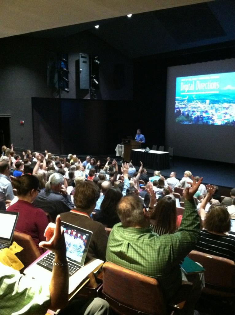
This past July I had the great opportunity to attend the Northeast Document Conservation Center’s Digital Directions 2014 conference. In a lucky turn, this year’s conference was held in Portland, Oregon, home of my alma mater, Reed College. In addition to reexperiencing the highlights of one of my favorite American cities, I was able to meet and engage with many people doing amazing work in digital collections across the country and beyond.

The conference covered a fascinating diversity of topics, from high-level project management and planning to specific examples of workflows and equipment setups. One of the first things impressed upon me was the fascinating diversity of digitization efforts occurring across the world. As the demand for digital content continues to expand, many institutions are rushing to fill that need. Because of this, it can often seem that no two institutions’ digital programs are the same, or even particularly similar.
To its credit, the Digital Directions did a phenomenal job accounting for these various setups. The three days were jam-packed with a fascinating variety of discussion topics and presentations. The first day consisted of mostly big-picture type talks. We discussed the interplay between digital preservation (maintenance of access to digital content) and digital curation (adding value to digital content), as well as how to craft each institution’s best practices and standards according to their needs. The day was wrapped up with an impressively no-nonsense discussion about rights and responsibilities from a legal perspective by Peter Hirtle, followed by a lovely meet-and-greet at the Portland Art Museum.
The following days covered a wide variety of topics, including a fascinating section about audio and video digitization (an area unfortunately outside my range of experience). However, it soon became apparent that the challenges faced by those audio and video digitization teams were remarkably similar to my own in the world of object and document reproduction. Many digitization projects face the same fundamental roadblocks: time, equipment, resources, access, and storage.
![]() |
| Image from NEDCC's twitter account |
While the specifics varied, these fundamental issues could not help but make themselves apparent. The relative merits of, say, cloud storage (to pick a random example), can be endlessly debated among digital librarians, and indeed I’d doubt there ever will be a definitive final-word on this topic. But the crucial takeaway must be a willingness to engage with these issues, understanding the risks and drawbacks inherent in each option so that they can be minimized, or at the very least understood fully so that we may deal with them more effectively in the future. Among the many useful things I learned at Digital Directions 2014, perhaps the most important one was that my own peers are an incredible resource, both within Dartmouth and world-wide. By learning through their experiences and sharing my own, I hope to do my part to keep the Dartmouth Library’s Digital Collection growing and improving well into the future.
Written by Ryland Ianelli
Tuesday, September 30, 2014
100-ish Days of Digital Preservation
Hello, there. It's been a little over 100 days since I started as Dartmouth College Library's first Digital Preservation Librarian. I've been working closely with staff in many departments to define my role and work out how best to ensure long term access to the Library's digital content. Here are some of the things that I've been up to:
I’m looking forward to my role in the Library continuing to
evolve and grow over time. As these and other projects develop, I will tell you
all about them here. Stay tuned for the next 100-ish days of Digital
Preservation!
- Maxed out our master file server space.
- Learned about awesome projects and connected with colleagues at Digital Preservation 2014.
- Made some head-way into assessing our e-resource preservation strategies.
- Used BagIt to package 45,000 files totaling 2413 GB for long-term storage (see above re: maxing out server space).
- Started digging into PREMIS .
- Learned to harness the power of Twitter for professional research #digipres .
- Started brainstorming strategies for preserving analog and born-digital a/v content.
- Dipped my toes into web and database preservation in response to a faculty inquiry.
- Got really excited about sustainability and digital humanities projects.
| Digital Preservation Brainstorming! |
Written by Jennifer Mullins
Tuesday, June 24, 2014
Digital Production Unit Update, Part 2
The primary
focus of the Digital Production Unit over the past few months has been to
incorporate the new reprographic system into our workflows. Since we started
using the new equipment in January we have been able to take advantage of its
speed and high quality imaging in a number of projects.
We have
redesigned our workflow for the Dartmouth College Photographic Files collection
to use the new camera exclusively. The previous workflow for this ongoing
project used two scanners on two computers and required additional post
production work to gather all of the images together. Our new workflow
consolidates all of that work onto one workstation. The streamlined workflow
has created noticeable positive effects in the time it takes to complete work
on this project.
Dartmouth
College Photographic Files collection: (http://libarchive.dartmouth.edu/cdm/search/collection/photofiles/collection)
One of the
first projects we tackled with the new equipment was to shoot recent Winter
Carnival Posters. This was a great learning opportunity for us. The posters are
large and colorful and gave us a chance to develop our skills with the hardware
and software. We will add individual new posters as they become available in future
Winter terms. In addition, we are in the planning stages of a project to
reshoot all of the posters to upgrade the quality of our master images.
Dartmouth
Winter Carnival Posters:(http://www.dartmouth.edu/~library/digital/collections/other/WinterCarnivalPosters.html)
We have also
been able to use the equipment in support of smaller projects in Rauner Special
Collections and for exhibits by Education and Outreach. Other work with the
camera includes one-offs for various projects, quality assurance and
corrections.
In other
news, we continue to redesign our work area. We recently moved all of the
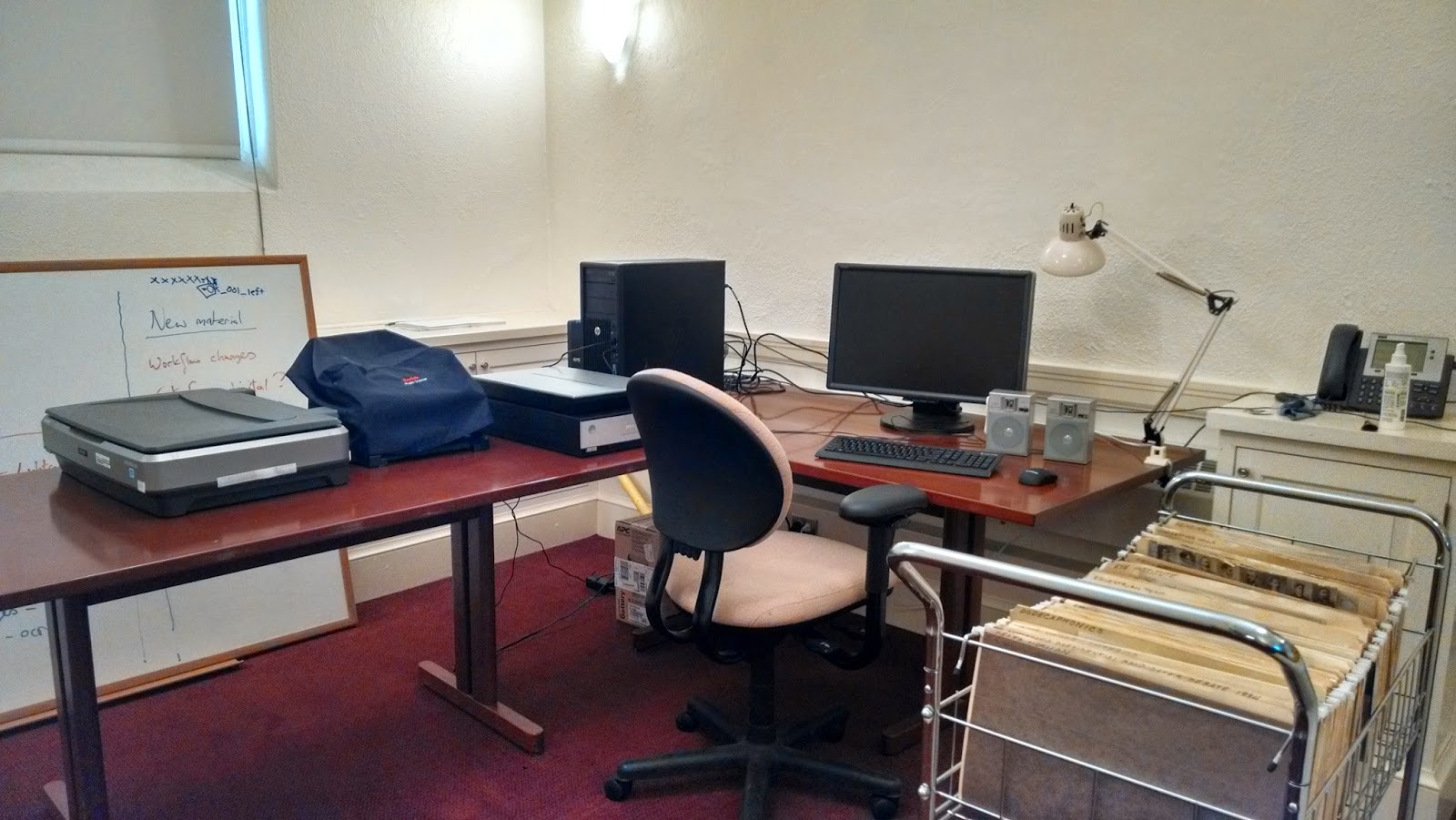
scanning equipment into room 2D, turning that space into our scanning lab.
By Willliam B. Ghezzi
Subscribe to:
Posts (Atom)