I was very fortunate to attend the Paper and Book Intensive this year, held at the Art Insitute of Chicago’s summer campus in Saugatuck, MI. Each time I attend PBI the experience gets better and better and this year was no exception. Among all the wonderful instructors, I took classes from Steve Pittelkow, Betsy Eldridge and Maria Fredericks. Below are some of my highlights from each class.
Marbling with Steve Pittelkow
Steve's direct instruction style ensured that each student left with the knowledge of how to create some of the many basic marbled patterns found in historical papers. With a song in his heart, he led us through the various steps in creating simple to advanced patterns. We were also able to experiment with our own designs and fancies.
 |
| The aim for color distribution is random symmetry. |
 |
| The more colors, the more intricate the pattern can be. |
 |
| After using a stylus to create a pattern, Steve lays down a sheet of alum-sized paper. |
 |
| This advanced technique is quite beautiful and gives a 3-D
effect, called Spanish Moire.
|
Photo Albums with Betsy Eldridge
In this class I was able to construct a sampler of various ways to mount photos and other heavier material. Betsy graciously pre-cut much of the material so we were able to focus on the construction of our pages.
For our final project we constructed a very complex album that incorporates an intricate arrangement of cloth hinges. It opens beautifully and very flat.
Interspersed with our tasks at hand, Betsy gave us many tips and tricks. Here is a trick to burnish and soften paper: take some beads and roll them around in a circle moving over the surface of your paper. You’ll notice a
dramatic difference afterward.
 |
| These are all of our completed photo albums displayed during
show and tell. |
Paper Cases with Maria Fredericks
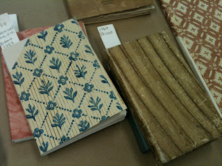
What I enjoyed so much in this class was the opportunity to explore and consider the function of the paper case in the context of history, and its diminishing quality over time. Looking at models representing the 15th to 17th centuries, it was clear how the sewing became abrreviated with the pressure to bind more in less time.
Many of the paper bindings have lovely decorated covers. Often these printed covers are produced on thinner paper and then become a covering to the primary case. We made our own decorated papers using acrylic and blocks cut
from a soft rubber.
 |
| Firmly placing the block into the color.
|
 |
| Printing the colored design onto our paper. |
 |
| A second color can be hand painted in to add to the
decoration.
|
A tip I learned: When folding over a shorter edge, place that edge under the larger portion when making your final hard crease. This helps the shorter edge stay put.
 |
| Maria demonstrates the steps to creating the case.
|
 |
| Lacing in the text block.
|
 |
| If a decorated paper is used, it is put on before the foredge
turn-ins are completed.
|
 |
| Here are some of our completed books.
|
PBI is a wonderful and invigorating experience. It brings together teachers, artists, conservators, paper makers, printers and more to exchange and share experiences and knowledge so that at the end everyone goes away with so much
more than they came with, including new friends to connect to.
Written by Deborah Howe.


No comments:
Post a Comment