
Here in the conservation lab, the most common use is a spine repair on a cloth-cased book. The repair uses a color-matched piece of muslin to replace a broken spine or hinge. The result is a visually unobtrusive repair, which is great for many of the older cloth bindings in the library. Our simple process for toning book cloth uses basic tools and materials, and is easy to set up.
To prevent strike-through when applying glue or paste in the final use, spread out the material on a hard, smooth surface (counter top, plexiglass, or Mylar). With a large brush, give the material a good coating of methyl cellulose and allow to dry before peeling it up. Once dry, it will separate nicely from your work surface. The methyl cellulose will have dried shiny and smooth on the bottom, creating a good barrier and surface for gluing out your material.
The next step is applying color, which can be done in one or multiple layers. In the lab we use acrylic paints which dry quickly and true to color. Mix the paint to best match the book being repaired. A small amount of methyl cellulose can be added to the paint, which makes it easier to spread. With a large paint or paste brush, paint the mixture onto the more textured side (the side that faced up while the methyl cellulose dried). If the color seems pale, add more paint to your mixture and/or additional coats after drying. When toning is finished and the last coat is dry, it is ready for use.
Here are some tips on basic color mixing:
- You can make any color you need by mixing different combinations and amounts of three primary colors and then altering the new color with black or white.

Primary colors: Red, Blue, Yellow 
Secondary colors: Violet (purple), Green, Orange - Make secondary colors by mixing equal parts of two primary colors.


- There are many gradations between each primary and secondary color on the color wheel. Any three of these together is an analogous color scheme. Mix them by gradually adding a little at a time of one color into the next.


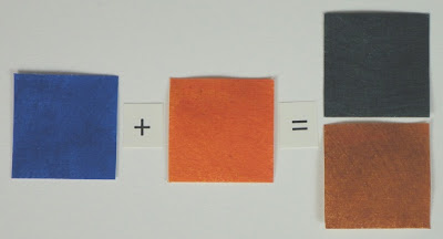
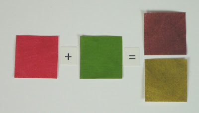
- To “dull down” a color or make it more brownish, add a small amount of its compliment (the color directly across on the color wheel). Example: to dull down blue add a little orange, etc.

- To make a color lighter or darker, add white or black. The new color is a “tint” or “shade”, respectively, of the original. Example: red + white = pink / tint of red, and blue + black = navy / shade of blue.
Tints:
Shades:


Great article on toning fabric and color mixing. Thanks for sharing it.
ReplyDeleteThanks, Dot! We're glad you enjoyed it!
ReplyDeleteDo you have a view about brands of acrylic?
ReplyDeleteSo many out there. It can be confusing... and expensive if you are wanting to experiment.
Which brands are considered suitable for conservation work? Are there preferable ingredients/ undesirable ingredients? (thanks. that's a lot of questions, I know..)
Hello Sonya:
ReplyDeleteThe two brands we typically use are the golden acrylics and liquitex. I believe both come in a solid and a more liquid consistency. If you were to pick one for conservation work I would recommend the golden brand. I don’t have any of the specs concerning the ingredients but my experience is that the golden brand has been noted as the brand to use for conservation work. If you just want to experiment I believe the liquitex brand might be slightly less expensive. I hope this helps. Let me know if I can help more.